

When it comes to designing your dream wedding invitations, every detail matters — including the envelope. As the very first thing your guests see, envelopes set the tone for your day before they even open the suite. While neutral tones will always have their place, pastel envelopes offer a fresh, romantic, and elevated way to tell your wedding story with color.
From soft blush to sunny lemon and serene blue, pastel wedding invitations feel effortlessly timeless while still making a subtle statement. Whether you're planning a warm-weather celebration or simply drawn to a light and airy palette, pastel envelopes are a beautiful way to reflect your wedding style from the very beginning.
Why Envelope Color Deserves a Second Look
When it comes to styling your wedding invitations, envelope color might seem like a small detail — but it’s one that can have a big impact. Choosing a colored envelope is a beautiful way to introduce personality into your suite without taking away from the clean, timeless design Shine is known for.
It’s also one of the most tangible ways to tie your stationery to your overall wedding vision. While design elements like typography or layout may feel more subtle to guests, a pale blue or blush pink envelope immediately conveys a sense of tone and palette. It’s a thoughtful detail that helps your invitations feel even more personal and intentional.
Designer Tip: Your envelope is your guests’ first glimpse into your wedding day. Pastel tones are an elegant way to share your aesthetic while keeping things timeless and refined.
How to Choose the Right Pastel for Your Style
Pastels are endlessly versatile — they can be soft and traditional, airy and romantic, or crisp and modern. Choosing the right pastel envelope is all about matching the feeling of your wedding. Think about your venue, season, and personal style. Are you drawn to lush garden florals? A destination with bright sunshine? Clean, minimal design?
The pastel shades in our collection are curated to work beautifully across a range of wedding styles. Whether you're envisioning a formal estate wedding or a breezy outdoor ceremony, there's a hue that fits your vision.
Envelope Colors We’re Loving Right Now
Each envelope color tells a different story — here are six pastel shades that bring their own personality to your wedding invitations.
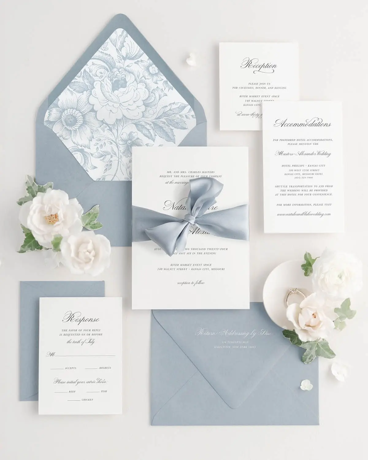
Sky – Light Blue with a Timeless Feel
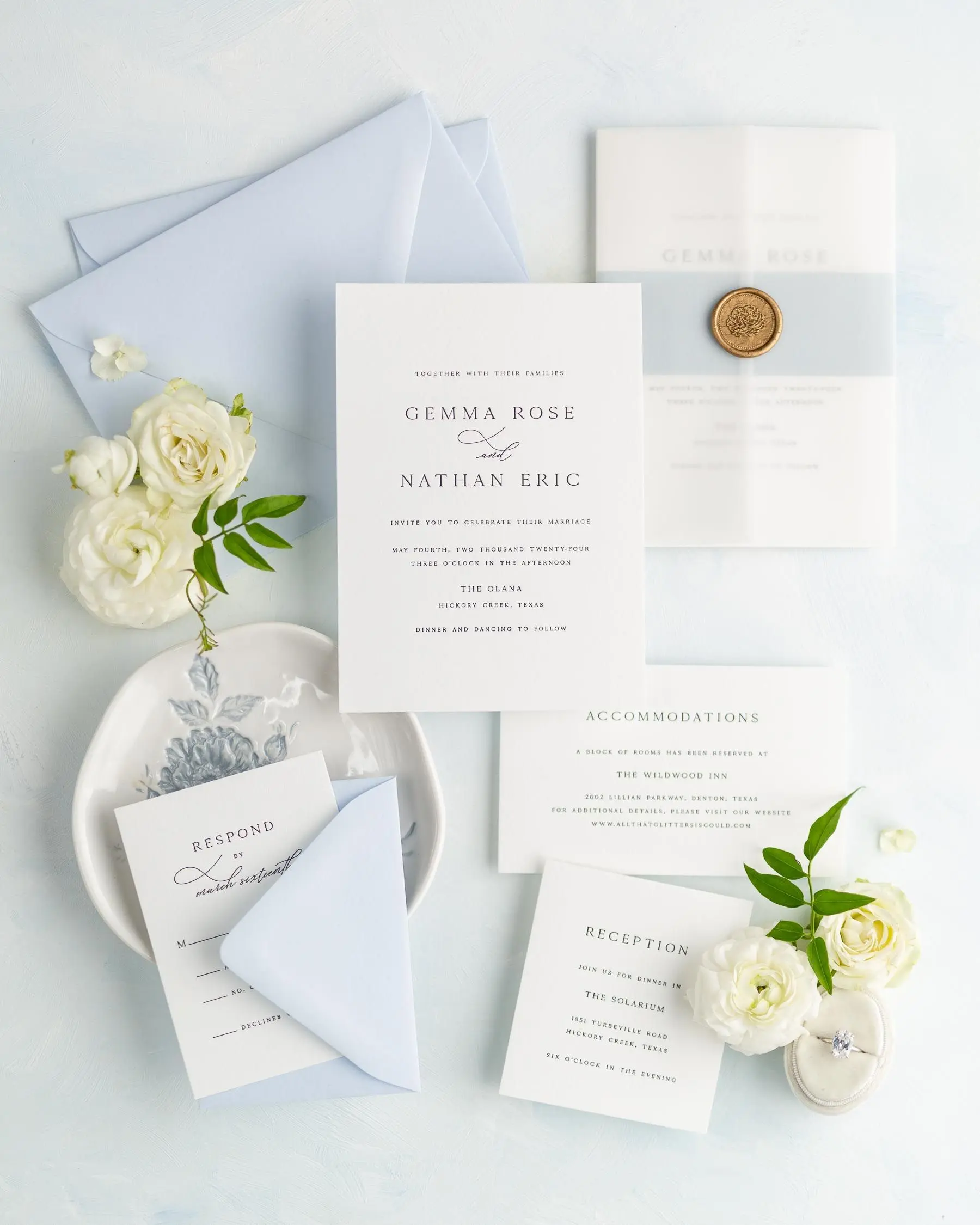
Featured with the Gemma suite
Sky is a soft, serene blue that brings a sense of calm and elegance to your invitation suite. Paired here with a powder blue belly band, vellum jacket, and a gold florette wax seal, this look is ideal for couples drawn to a classic palette with a modern, airy feel.
Wisteria – Romantic with a Hint of Lavender
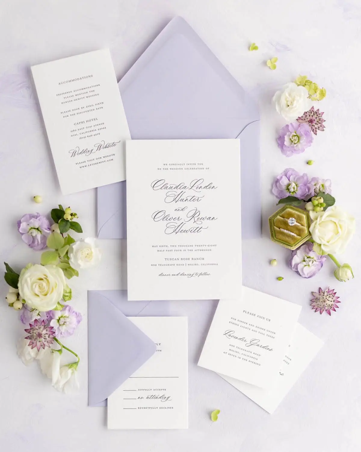
Featured with the Claudia suite
Wisteria is a light, romantic lavender that adds just enough color while keeping your suite feeling airy and elevated. A fresh twist on classic wedding pastels, this shade has become a modern favorite for couples looking for something a little less expected. It pairs beautifully with muted florals or a soft spring palette.
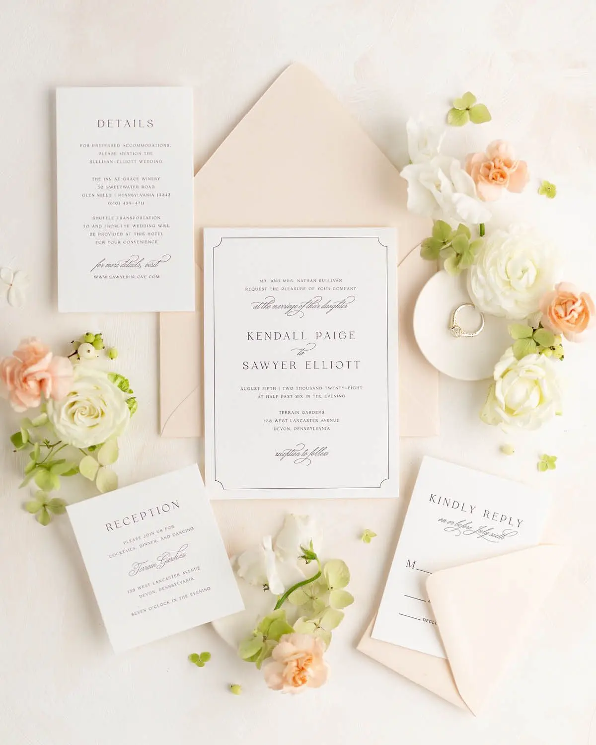
Ballet – Classic Blush with a Modern Edge
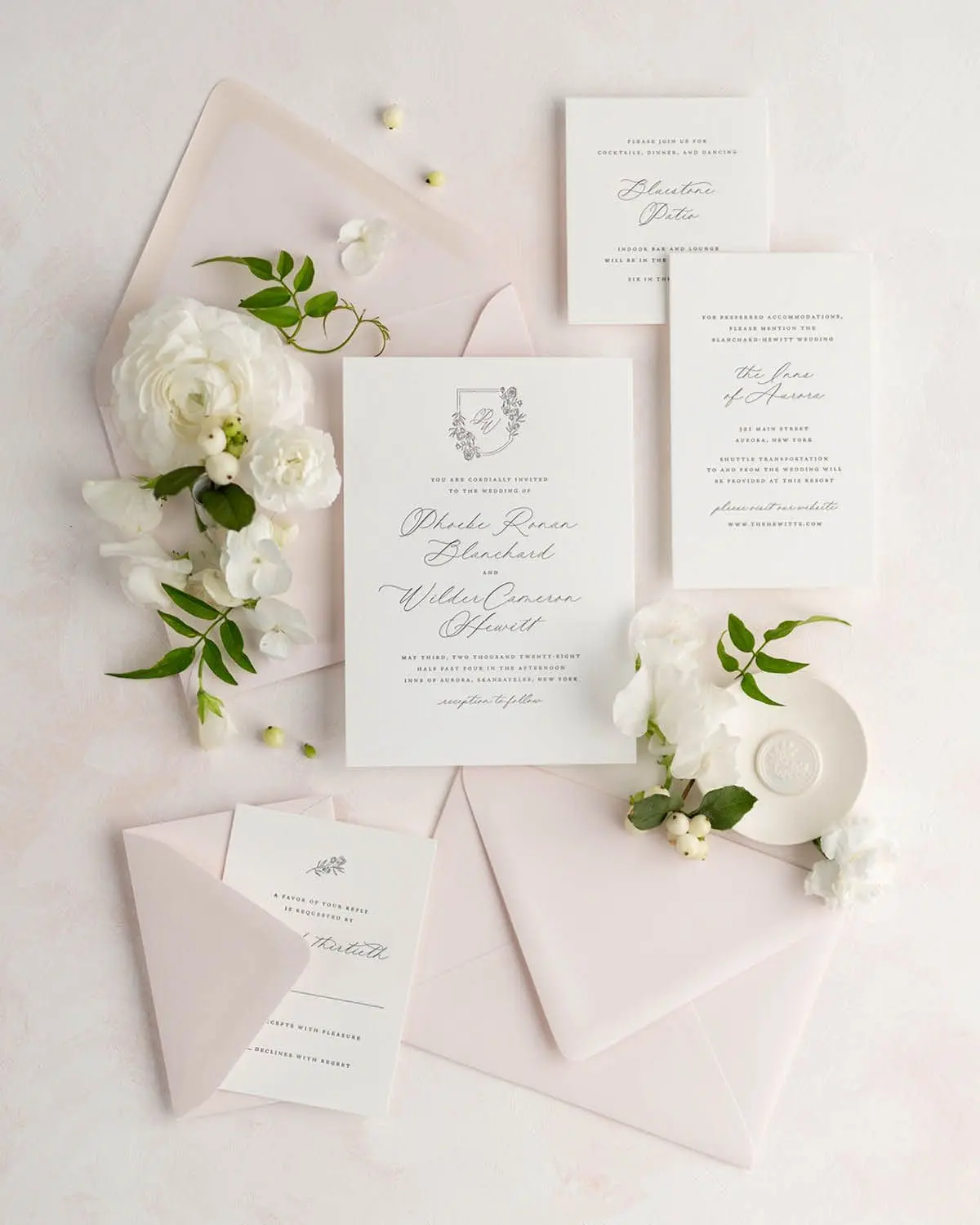
Featured with the Phoebe suite
Ballet is a pale blush pink that works beautifully as a modern neutral. It adds a touch of warmth and romance without overwhelming the suite, making it a perfect choice for couples who want a soft, elevated look. This shade brings just enough color to feel intentional, while still letting the design shine.
Pistachio – Crisp, Clean, and Understated
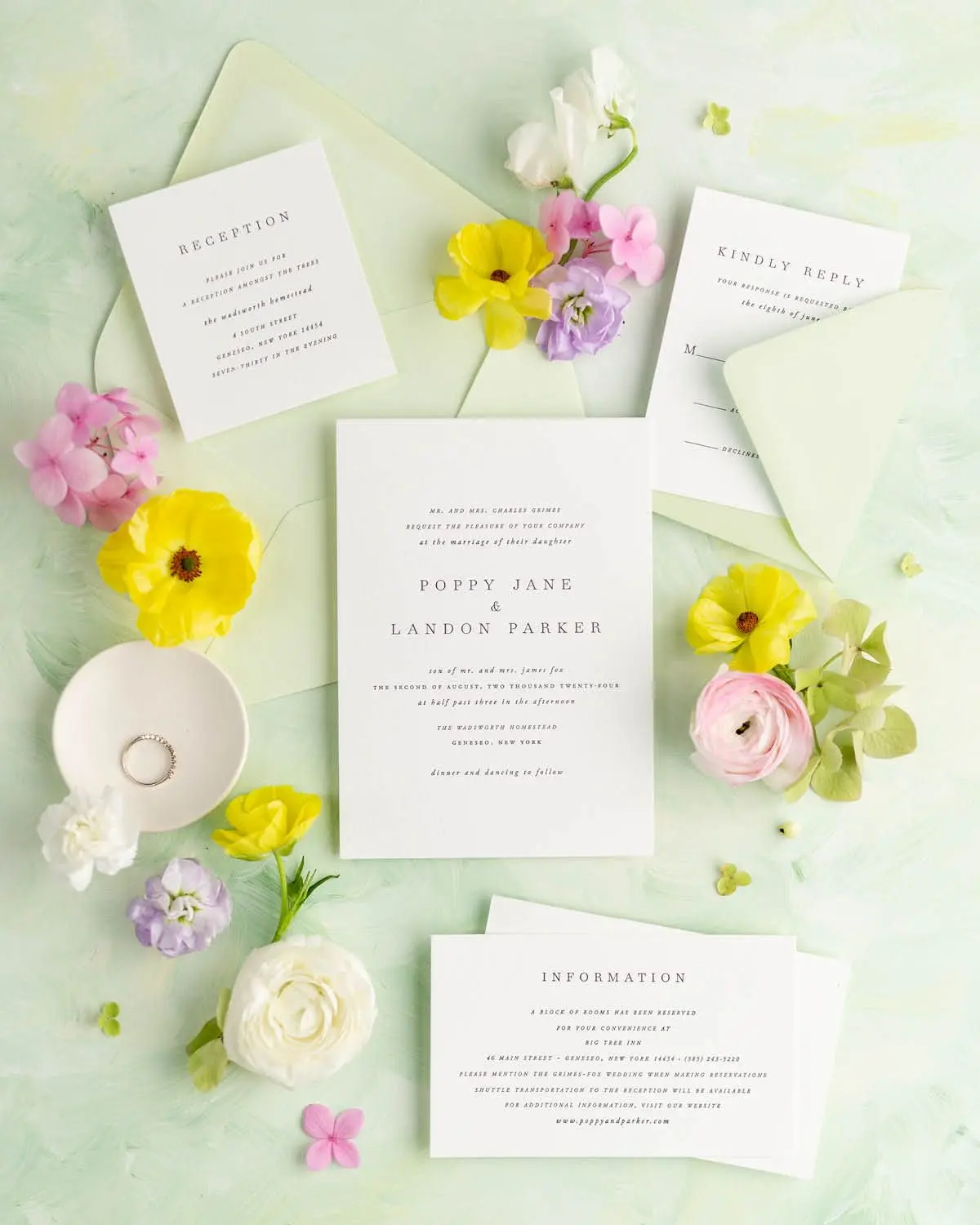
Featured with the Poppy suite
Pistachio is a soft green with a playful edge — a unique choice for couples who want their suite to feel thoughtful, refined, and a bit unexpected. It brings subtle color to the suite while still feeling elevated, making it a beautiful fit for garden celebrations or modern floral styling.
Limoncello – Cheerful and Full of Personality
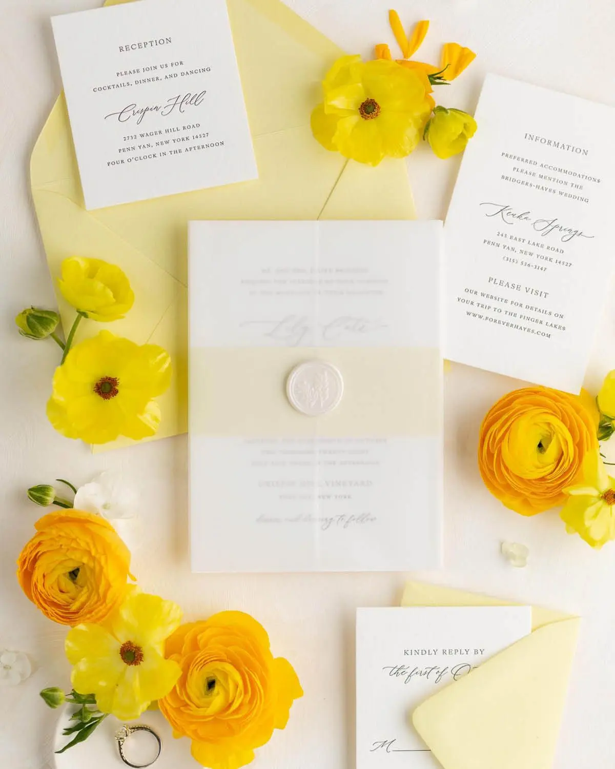
Featured with the Lily suite
This envelope color brings a joyful energy to your suite while still feeling polished and intentional. Paired with a daisy belly band, vellum jacket, and pearl wreath wax seal, Limoncello is perfect for couples who want something sunny and spirited — a bold choice that still feels perfectly at home in a timeless suite.
Glacier – A Cool Neutral That Still Adds Depth
Featured with the Classic Script suite
Glacier is a light, muted blue with soft grey undertones that brings quiet depth to your wedding invitations. It’s a beautiful choice for couples who want something understated but still distinctive. This shade adds a sense of calm and sophistication while keeping your suite timeless and refined.
Styling Pastel Envelopes with Wax Seals, Ribbon & Vellum
Pastel envelopes look stunning on their own, but when paired with thoughtful embellishments, they create an invitation experience that’s truly unforgettable. Wax seals, vellum jackets, silk ribbon, patterned envelope liners, and subtle belly bands are all beautiful ways to layer texture and detail into your suite.
Designer Tip: Choose embellishments that complement your envelope color without competing with it. For example, choose a liner color from the same color family as your envelopes to create a monochromatic look with added depth.
Shine’s real-time suite builder makes it easy to style your suite and experiment with different combinations — so you can see your vision come together instantly, all in one place.
Not Sure Which Color Fits Your Vision?
If you're feeling torn between a few favorite shades, you're not alone — envelope color is one of the most personal (and fun!) parts of styling your suite. A great first step is to take our quick invitation styling quiz. It helps narrow down your aesthetic and points you toward colors and designs that fit your overall vision.
Once you have a style in mind, you can order a sample set to see the design and envelope color up close. If you’re deciding between multiple color or liner options, you can add additional envelopes to your sample order to explore a few combinations in person.
FAQs About Pastel Wedding Invitations
What are the most popular pastel envelope colors for wedding invitations?
Blush pink and light blue are perennial favorites. Newer options like soft lavender, lemon yellow, and misty green are gaining popularity for couples who want something unexpected yet timeless.
Can pastel envelopes work for formal weddings?
Absolutely. When paired with traditional typography, letterpress printing, or formal invitation wording, pastel envelopes feel just as elevated and appropriate for black-tie affairs.
Do I need to match my envelope to my wedding colors?
Not at all. You can coordinate, contrast, or use envelopes to introduce a complementary color. If you’re unsure, our design team is happy to help guide your decision.
Can I print guest addresses on pastel envelopes?
Yes! All of our envelopes, including the pastel colors, are address-printing friendly. We offer multiple ink colors that are fully legible while keeping your suite cohesive and beautiful.
Bring Your Wedding Vision to Life—One Detail at a Time
From classic blush to unexpected lemon or lavender, pastel envelopes offer a beautiful way to personalize your wedding invitations with intention. Whether you’re just starting to explore your options or finalizing the finishing touches, choosing a color that reflects your style will help your suite feel even more meaningful. With Shine’s styling quiz, real-time suite builder, and custom samples, it’s easy to bring your ideas to life—down to the very last detail.


Order a Custom Sample Set
Experience our papers, colors, and printing in person.
Not Sure Where to Start?
Take our styling quiz to find the right look and configuration for your stationery.
Bring Your Vision To Life
Browse our invitations and find the perfect design for your wedding.
A Difference You Can Feel
Make a statement with our luxurious letterpress wedding invitations
See Us Shine
Client visions brought to life #shinenewlywed