

There’s something endlessly romantic about soft blue stationery, especially when paired with hand-drawn calligraphy and delicate floral details. Our Phoebe Letterpress Wedding Invitations capture that timeless charm with a fresh, modern touch.
Featuring tactile letterpress printing and an artful balance of script and serif typography, Phoebe feels at once classic and effortlessly refined.
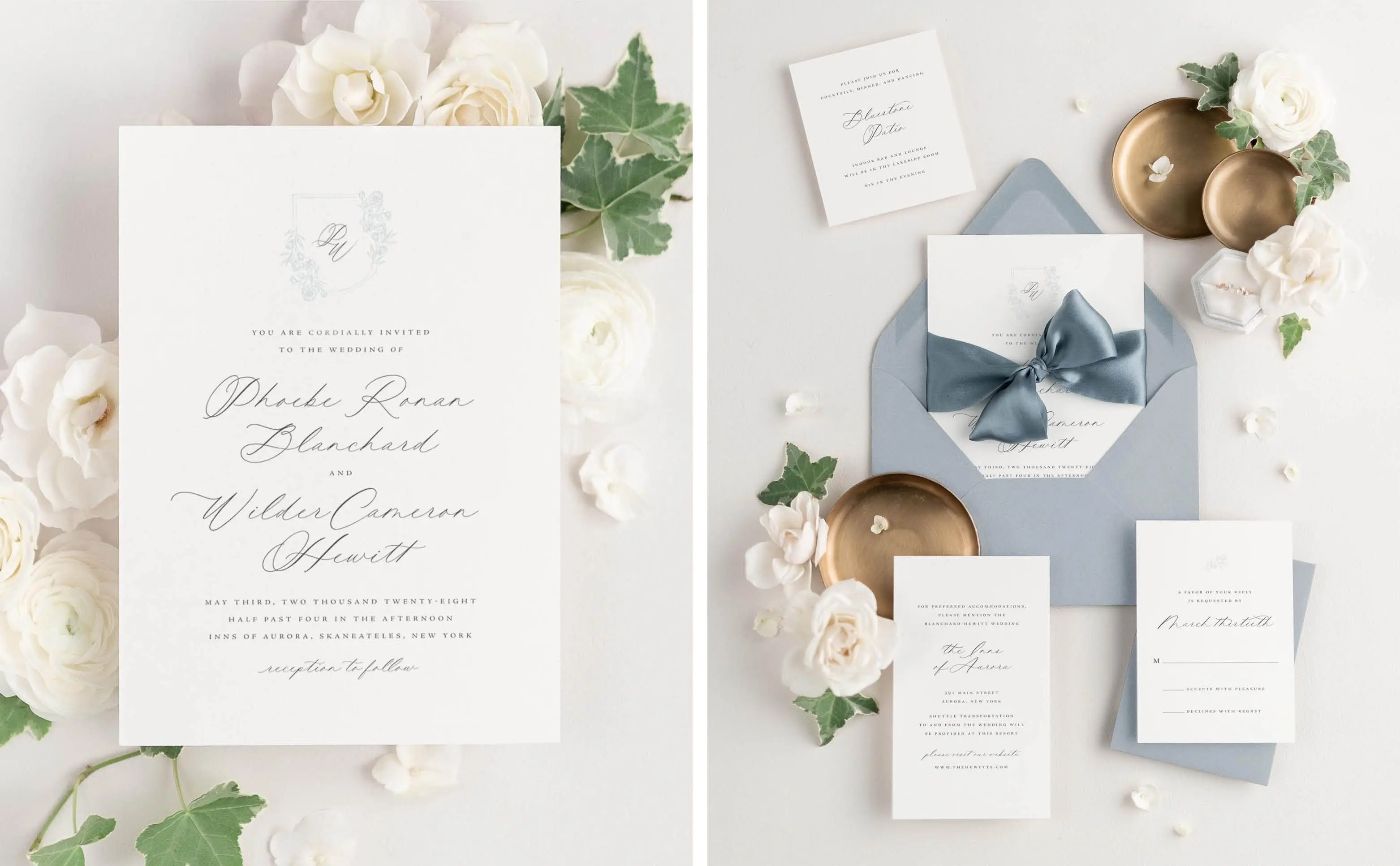
From its serene light blue colored envelopes to the intricate floral monogram, every detail of the Phoebe suite was designed to feel personal and elevated. If your wedding vision leans toward European-inspired romance — elegant venues, delicate blooms, and heirloom details — Phoebe was made for you.
Modern Calligraphy Wedding Invitations
At the heart of Phoebe’s design is its modern calligraphy font — a hand-drawn script used to highlight the most meaningful details and add a touch of artistry to the suite. Paired with a refined serif typeface, it brings a graceful sense of contrast that feels both timeless and fresh.
The calligraphy adds softness and movement, while the serif lettering keeps the overall look clean and sophisticated. Together, they create a suite that feels romantic without being overly ornate — a look that’s modern, elegant, and effortlessly classic.
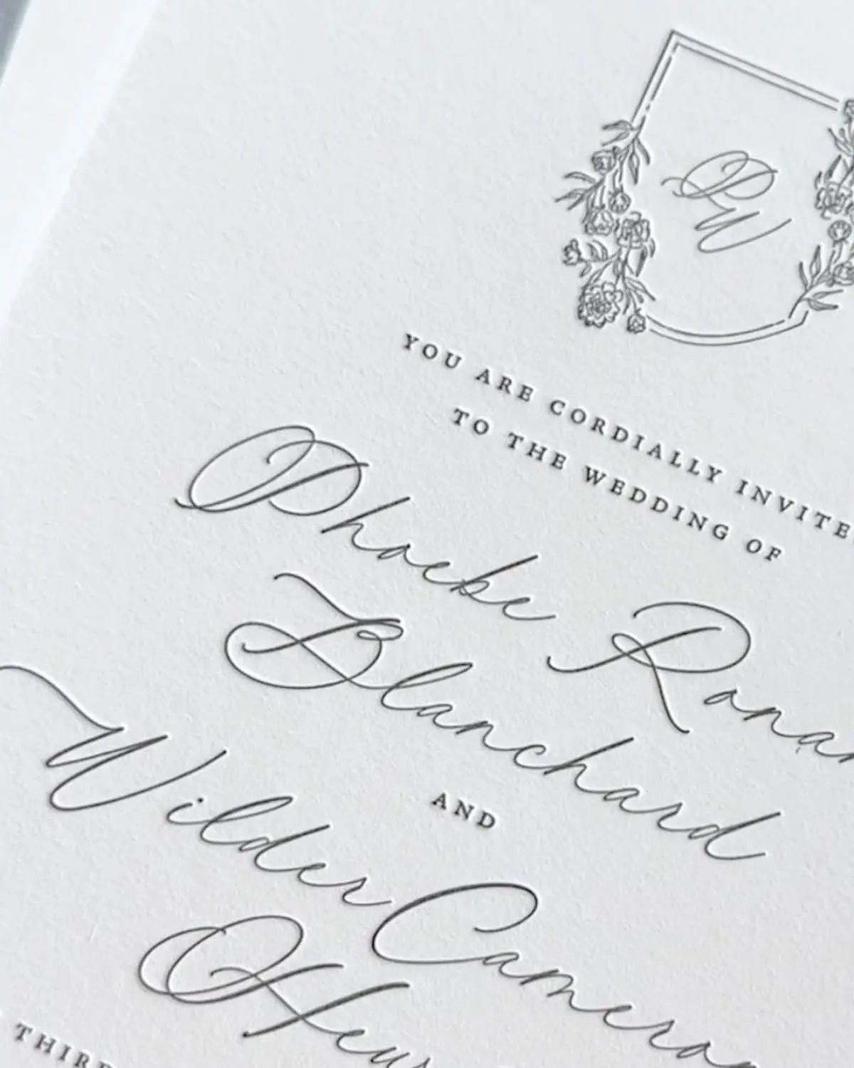
A Floral Monogram That Ties the Wedding Suite Together
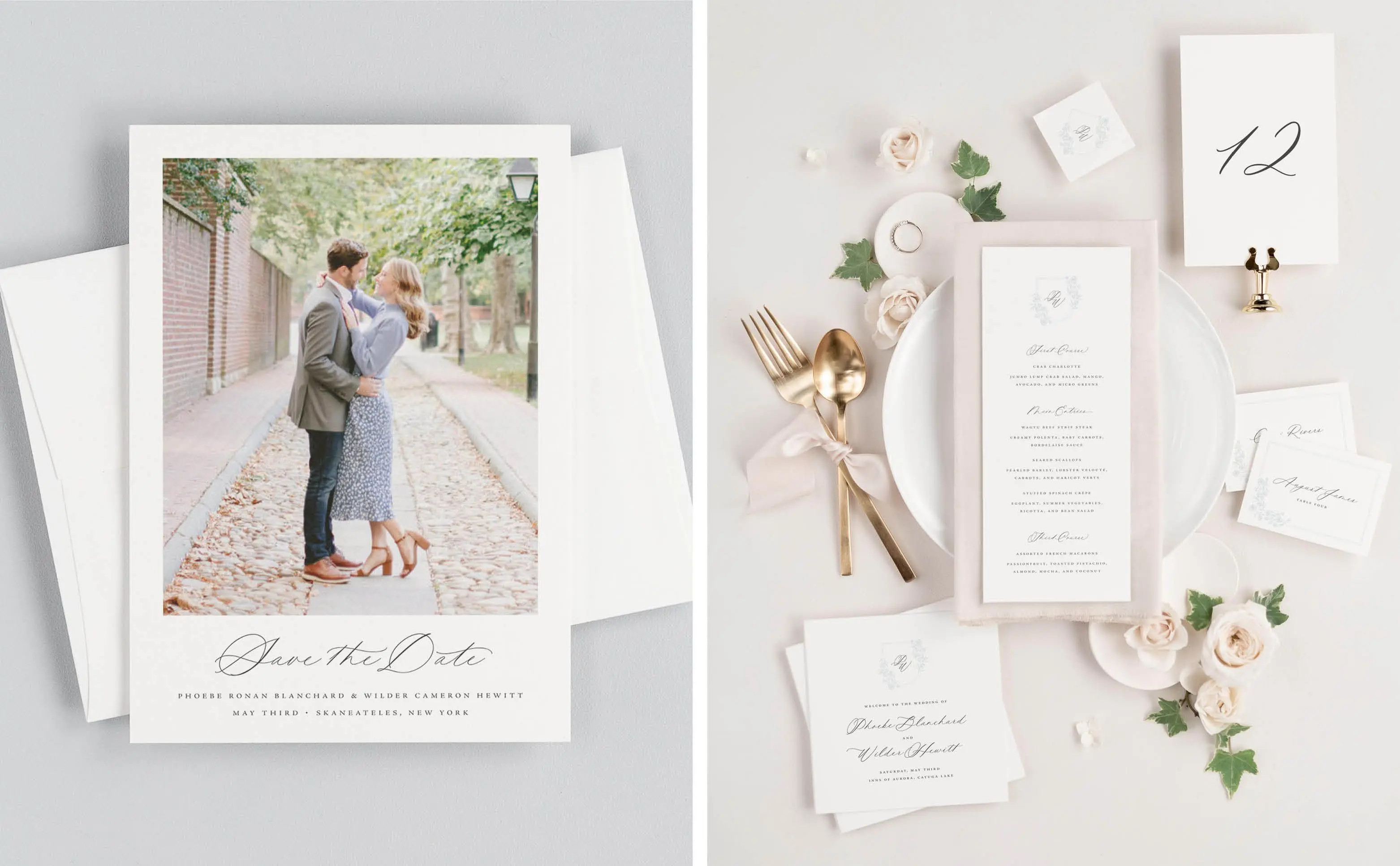
No element captures Phoebe’s charm quite like its delicate floral monogram. Crowning the top of the invitation, it frames the couple’s initials in a soft botanical wreath — a refined focal point that immediately draws the eye. Designed to be both elegant and versatile, this detail carries seamlessly across the suite and coordinating pieces, from save the dates to menus and signage.
The monogram adds a personal touch that feels at once classic and current. Its floral illustration brings a subtle sense of romance, while the delicate lined frame gives structure and balance. The refined shape and subtle detailing make it a lasting favorite for couples drawn to understated elegance.
Designer Tip: Choosing a design with a monogram is one of the simplest ways to create a cohesive stationery collection. By carrying this detail from your invitations to your day-of pieces, every element feels intentionally connected and beautifully consistent.

Dusty Blue Wedding Color Palette: Layering Tones for a Refined Look
This color palette is inspired by the calm beauty of soft, layered blues. Each shade plays a role in creating depth and sophistication.
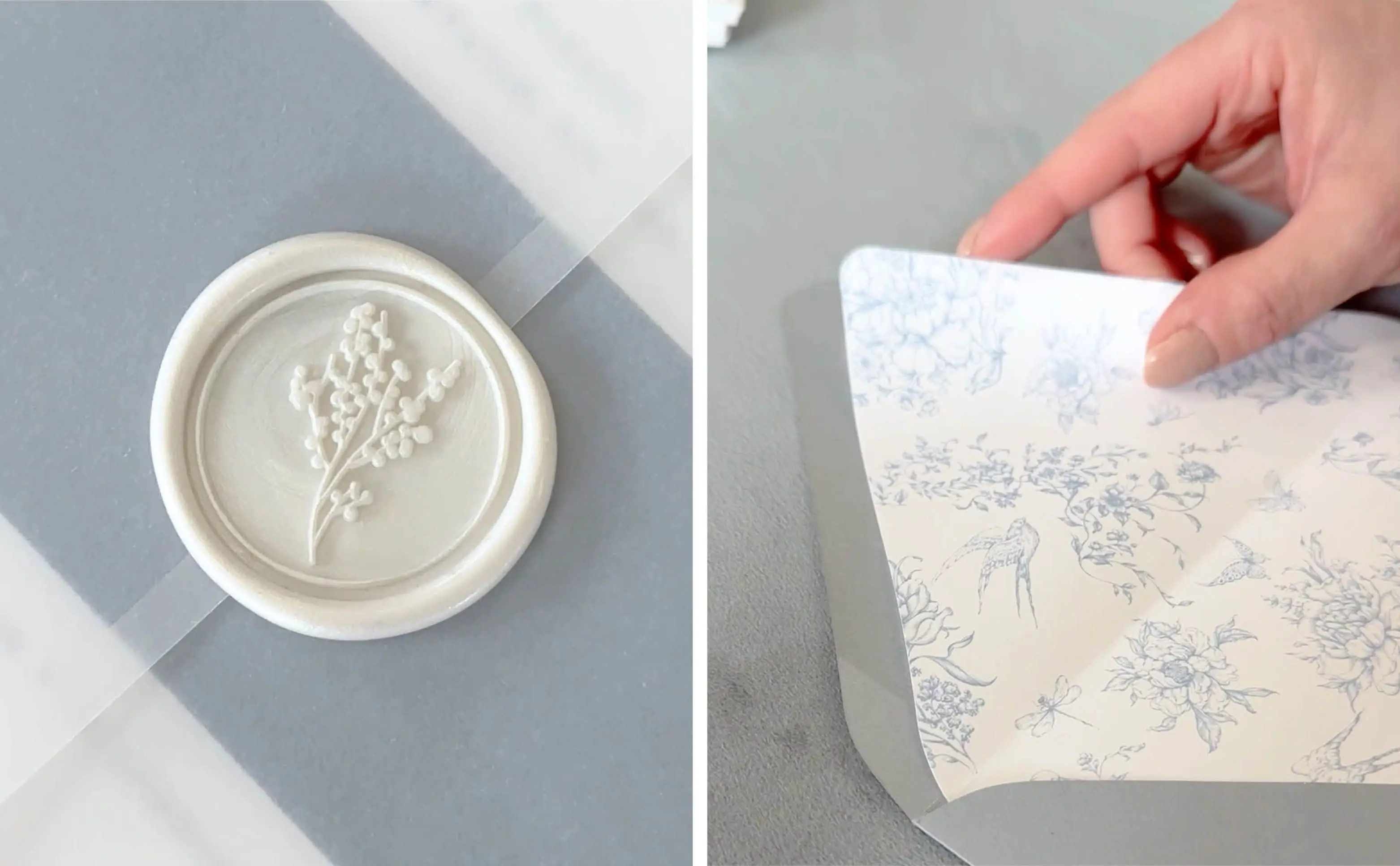
The suite is paired with Glacier envelopes, a light dusty blue that instantly feels elegant and fresh. Inside, the Wren liner adds another subtle touch of color — a French-inspired floral pattern printed in light blue ink that evokes the charm of hand-painted porcelain.
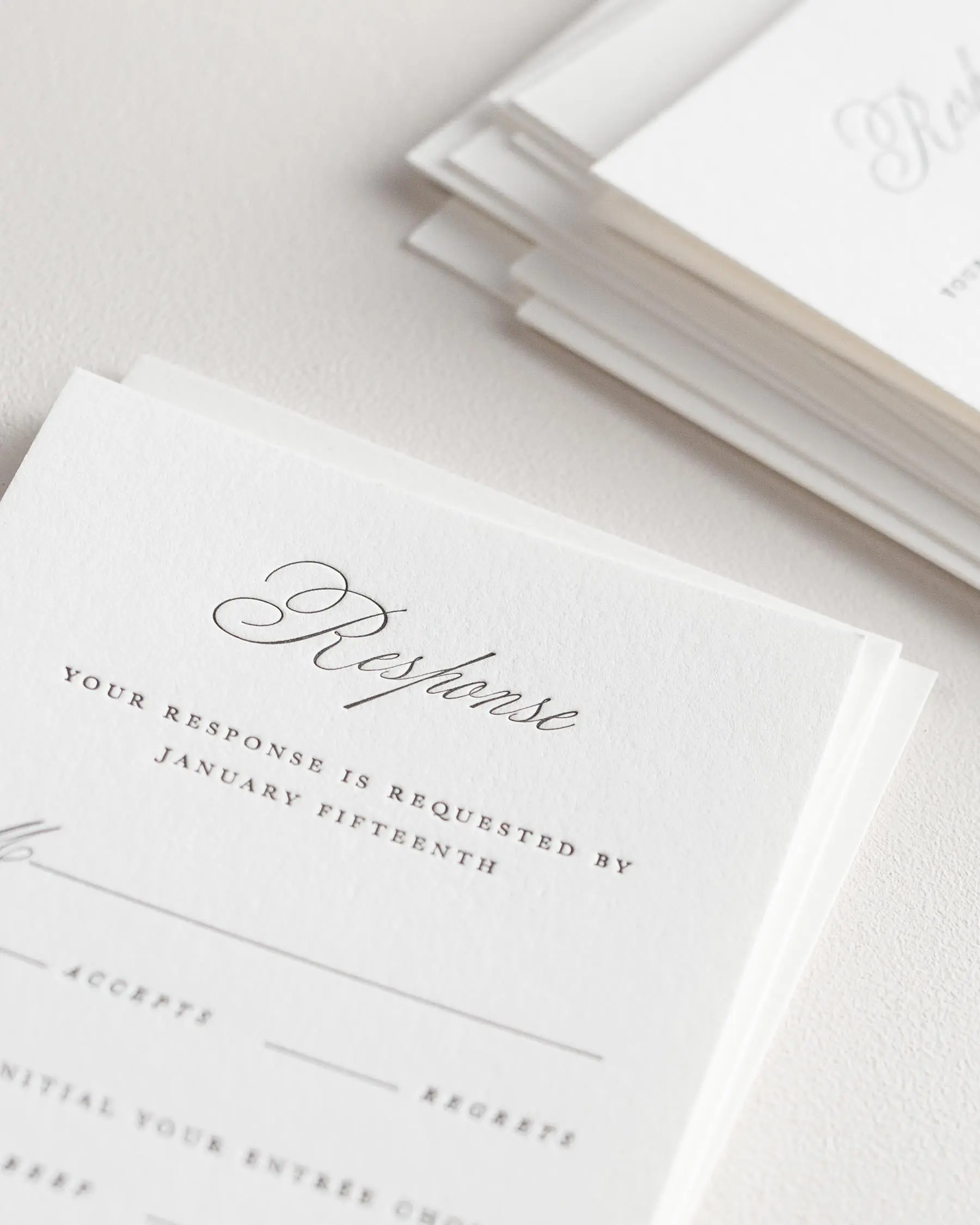
Chambray response card envelopes introduce a deeper dusty blue that adds contrast and dimension without overwhelming the design. The mix of envelope tones creates a beautifully balanced palette that feels elevated and cohesive.
To finish the suite, a belly band in Mineral, a muted steel blue, ties the layered hues together seamlessly. Wrapped in a vellum jacket and finished with our Pearl Posy wax seals, this suite is as lovely to open as it is to send. The translucent vellum adds a soft, romantic reveal, while the pearlescent wax seal brings just the right touch of sophistication.
Designer Tip: To create visual balance, mix light and medium tones within the same color family — it gives your suite dimension while maintaining a cohesive palette.
The Inspiration Behind Phoebe: A Romantic Wedding Invitation Suite
We sat down with the designer behind our Phoebe suite to learn more about the inspiration and artistry that brought this romantic design to life.
Q: What sparked the idea for Phoebe?
“I wanted to create something delicate and romantic with a design that featured a floral monogram that could be carried across the entire suite and day-of pieces.”
Q: How did you choose the calligraphy style?
“I loved the idea of incorporating a hand-drawn script that added a soft, modern touch while keeping the overall look timeless.”
Q: What feeling do you hope Phoebe gives couples when they first see it?
“I hope it feels graceful and intentional — like a quiet introduction to everything their wedding will be. It’s designed to make that first impression feel elegant and deeply personal.”

Why Letterpress Printing Adds Depth and Romance to Your Wedding Suite
There’s nothing quite like the tactile impression of letterpress invitations. Each piece of Phoebe is pressed by hand into 100% cotton paper, creating a beautiful debossed texture that you can see and feel. Printed in soft black ink, the contrast is crisp yet refined — giving each piece a quiet sophistication that never feels overstated.
Letterpress printing enhances the calligraphy’s natural flow, giving every stroke a slight shadow and depth that digital printing can’t replicate. The result is elegant and enduring, designed to be cherished long after the wedding day.
Designer Tip: If you love the look of letterpress, consider choosing double-thick cotton stock. Its added weight enhances the tactile feel of letterpress while giving your suite an extra sense of substance and refinement.
A Smooth Alternative: Phoebe in Classic Printing
For couples who love Phoebe’s design but prefer a smooth matte finish, the suite is also available in our Classic Printing option. Printed on luxe white matte cardstock, this variation offers the same refined typography and floral detailing in a polished, flat-printed format.
Shown here in the same soft shades of dusty blue, this version is styled with Glacier envelopes and finished with a steel blue ribbon for a subtle, romantic presentation.
As with all of our designs, Phoebe can be customized in any color palette to complement your wedding aesthetic — from timeless neutrals to rich seasonal hues.
Your Complete Wedding Suite From First Look to Final Detail
Phoebe is available as a complete wedding stationery collection, including everything from save the dates to coordinating menus, programs, and signage for your day-of details. Each piece can be personalized with your wording, color palette, and more.
If you’re still exploring your options, try taking our Styling Quiz to discover which invite designs best match your aesthetic. Or, if you’d like to experience Phoebe’s craftsmanship in person, you can order a sample set to see the quality, paper, and print methods firsthand.
Designer Tip: Think of your invitation suite as your guests’ first glimpse into your celebration. Choosing styling details that reflect your wedding aesthetic — from color and paper to embellishments — helps set expectations from the very beginning. When those same elements appear throughout your day-of stationery, it creates a beautiful sense of continuity for your guests, making every moment feel intentional and connected.
Customized Wedding Suites with Expert Designer Support
At Shine, every couple works one-on-one with an experienced designer to perfect their suite. Our team provides expert guidance on design details, etiquette, and layout to ensure your stationery reflects your personal style. We can even include modern touches like a QR code for easy RSVP collection without compromising Phoebe’s timeless aesthetic.
Your designer will refine proofs until every detail feels just right, and nothing prints until you love it. It’s a process designed to feel effortless, personal, and completely tailored to you.
Frequently Asked Questions
Are Dusty Blue Wedding Invitations Formal Enough for a Traditional Wedding?
Absolutely. Blue tones — especially shades like dusty blue or navy — can be incredibly elegant when paired with classic typography and refined details. A timeless layout and high-quality printing method, like letterpress, keep the design formal while still adding a hint of personality.
Is Letterpress Printing Worth the Investment for Luxury Wedding Invitations?
For couples who value craftsmanship and texture, letterpress printing is unmatched. Each piece is pressed by hand onto cotton paper, leaving a deep, tactile impression that feels as beautiful as it looks. It’s a timeless technique that adds dimension and luxury — something your guests will notice the moment they open the envelope.
When should I order my wedding invitations?
We recommend placing your order about 4–6 months before your wedding date. This allows plenty of time for design, proofing, and assembly — and gives you a little breathing room before mailing. If you’re planning to include custom details or letterpress printing, ordering earlier is always a good idea to ensure everything arrives stress-free and perfectly timed.
What Are Double Envelopes and Do You Need Them for Wedding Invitations?
Double envelopes are a traditional stationery detail that includes both an inner and outer envelope. The outer envelope protects your suite during mailing, while the inner envelope holds the invitation and enclosures your guests will see first. They’re especially recommended for letterpress suites or designs with embellishments like wax seals or ribbon. While not always required, double envelopes add a refined, formal touch and help ensure your invitations arrive in perfect condition.
How Do I Personalize Our Wedding Invitations to Reflect Our Story?
The most memorable wedding invitations are the ones that reflect who you are as a couple. From choosing a color palette that complements your event to incorporating your monogram or a meaningful motif, each detail can tell a part of your story. At Shine, we offer endless ways to customize your suite — from printing and envelope style to ink colors and embellishment options — so your stationery feels personal, polished, and uniquely yours.

A Wedding Suite That’s Romantic, Refined, and Unforgettable
From its soft palette and tactile letterpress impression to the hand-drawn calligraphy that makes every detail feel personal, Phoebe embodies what we love most about timeless stationery — it’s elegant, romantic, and beautifully designed to last.
Explore the Phoebe Letterpress Wedding Invitations to see how this suite can set the tone for your own celebration.


Order a Custom Sample Set
Experience our papers, colors, and printing in person.
Not Sure Where to Start?
Take our styling quiz to find the right look and configuration for your stationery.
Bring Your Vision To Life
Browse our invitations and find the perfect design for your wedding.
A Difference You Can Feel
Make a statement with our luxurious letterpress wedding invitations
See Us Shine
Client visions brought to life #shinenewlywed